Celluloid Living Rooms: 10 Famous Movies That Turned MCM Furniture into Co-Stars
Mid-century modern furniture wasn’t just background in classic films; it was shorthand for “this character has taste, money, or both.” Here are ten movies where the credenzas, lounge chairs, and shag rugs deserve their own IMDb credits.

Paul McCobb: The Designer Who Made Mid-Century Modern Feel Like Home
If Milo Baughman was the flashy chrome prince of MCM, Paul McCobb was the quiet poet of affordable elegance. From 1945 to the late 1960s, McCobb designed over 1,000 pieces that looked expensive, cost a fraction of Knoll prices, and somehow ended up in half the suburban living rooms of the Eisenhower era. His influence is still everywhere—every tapered brass leg, every clean-lined credenza, every “inspired by McCobb” shelf on Wayfair owes him rent.
When Oscar Niemeyer Met Broyhill: The Brasília Line That Brought Brazilian Curves to American Suburbs
In 1962, North Carolina furniture giant Broyhill Premier unveiled its most daring collection ever: Brasília. Credenzas with cantilevered tops, sculptural chair backs that looked like boomerangs, walnut cases that floated on tapered brass legs; it was mid-century modern on a caffeine high. The name wasn’t marketing fluff; the designs were directly inspired by Oscar Niemeyer’s just-completed capital city, Brasília, and Broyhill wanted every American ranch house to feel a little bit like the future.

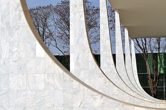
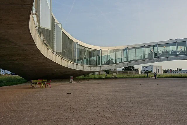
Five Mid-Century Modern Office Buildings That Still Steal the Show
The 1950s and 60s weren’t just about suburban ranch houses—corporate America wanted headquarters that screamed “We’ve arrived, and we brought the future with us.” These five MCM office icons did exactly that, and they’re still turning heads in 2025.

Milo Baughman: The Quiet King of Mid-Century Cool
If mid-century modern had a signature silhouette, it’s probably sitting in a Milo Baughman frame right now. The man never chased trends—he set them, then made them look effortless. From the 1950s to the 1980s, Baughman designed over 1,000 pieces that still dominate vintage listings, Dwell photo shoots, and every furniture flipper’s wildest dreams.
Who Was He?
Born in 1923 in Kansas, Milo Baughman was drafting furniture plans at age 13. After WWII, he landed in California, opened a studio, and by 1953 co-founded Thayer Coggin—the partnership that would produce his iconic lines for the next five decades. He taught at Brigham Young University, sketched on cocktail napkins, and refused to sign most of his work because “good design should speak for itself.” (Cue every eBay seller crying.)
The Baughman DNA
His furniture feels like jazz: structured, but loose in all the right places. Hallmarks:
Chrome + upholstery combos that look like architecture wearing cashmere.
Flat-bar frames (those thin, polished steel edges you can spot from across a showroom).
Generous proportions—sofas deep enough to nap on, chairs that actually fit humans.
Neutral palettes with punch: taupe velvet, olive leather, rosewood burl, and the occasional burst of mustard or teal.
The Greatest Hits
Thinline Collection (1950s–60s) The chrome cube bases that launched a thousand copycats. Case pieces float on razor-thin frames; headboards look like minimalist sculptures.
The 1968 Lounge Chair (Model #1431) Low, wide, tufted, and wrapped in leather. Put it on a shag rug with a walnut credenza and you’ve basically recreated 1972 Beverly Hills.
Parsons-style tables with burl wood He didn’t invent Parsons, but his olive-ash burl versions (1970s) are the ones that sell for $4,000 on 1stDibs today.
The Arch Patch Chair (1970s) Chrome arches, tight upholstery, zero bulk. It’s the chair that made every other swivel look clunky.
Sectionals that actually work Long before “modular” was a buzzword, Baughman was doing pit-group configurations that could wrap an entire conversation pit.
Why He Still Rules in 2025
Timeless ratio: His pieces photograph perfectly on Instagram—clean lines, no fussy details.
Built like tanks: Thayer Coggin still uses the original joinery. A 1965 sofa survives kids, dogs, and three cross-country moves.
Celebrity pedigree: Everyone from Waldo Fernandez to Kelly Wearstler specifies reissued Baughman for high-end interiors.
Modern Revival
Thayer Coggin never stopped production, so you can buy a brand-new #74 Chair in 2025 for about $3,800. Vintage originals range from $800 (needs reupholstery) to $15,000 (mint burl credenza, signed). Design Within Reach and Article both do respectful “inspired-by” versions under $1,500 if you’re not ready to hunt.
One Sentence Legacy
Milo Baughman didn’t just design furniture—he designed the way we want to sit, lounge, and show off for the next seventy years.
Next time you sink into a low chrome-framed sofa and think, “This feels like money,” thank Milo. Then check the label—chances are it says Thayer Coggin.
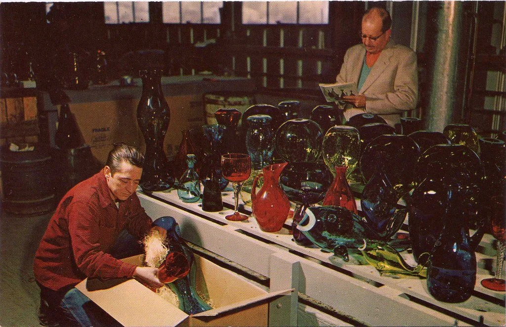
Mid-Century Glass: The Sparkle That Defined an Era
Walk into any 1950s–1970s living room and the light was doing tricks—bouncing off starburst chandeliers, fracturing through chunky ashtrays, or glowing amber inside a Blenko decanter. Mid-century glass wasn’t just tableware; it was affordable sculpture for the masses. Here are the main types and the makers who turned molten sand into icons.
Five Women Who Rewrote Architecture’s Rulebook
Architecture has long been billed as a boys’ club, but these women didn’t just knock on the door—they redesigned the whole building. Here are five trailblazers who shaped the 20th and 21st centuries with work that still turns heads.
1. Eileen Gray (1878–1976) – The Quiet Modernist Who Out-Cooled Le Corbusier
While the boys were busy drawing boxes on stilts, Irish designer Eileen Gray was crafting sensual, human-scaled masterpieces. Her 1929 villa E-1027 in Roquebrune-Cap-Martin is basically the sexiest house ever built: sliding screens, built-in furniture, cork floors, and a color palette that whispers instead of shouts. Le Corbusier was so obsessed (and jealous) that he painted garish murals all over it while she was away. Gray’s comeback? She lived to 98 and watched the world finally recognize her as the true genius of the pair.
Iconic piece: the adjustable Bibendum chair (still in production by ClassiCon) and the E-1027 table you’ve definitely seen on every mid-century mood board.
2. Zaha Hadid (1950–2016) – The Queen of Curves
Before “parametricism” was a buzzword, Zaha was drawing impossible swoops on napkins. Born in Baghdad, trained at the AA in London, she waited decades for clients brave enough to build her visions. When they finally did—Heydar Aliyev Center (2012), MAXXI Museum (2009), the London Aquatics Centre—she delivered buildings that look like they’re in motion even when standing still. First woman to win the Pritzker Prize (2004), and she did it wearing Issey Miyake pleats and zero apologies.
Fun fact: her fire station for Vitra (1993) was so radical the firefighters complained it was “unfunctional.” She never looked back.
3. Denise Scott Brown (1931–) – The Half of Venturi Scott Brown They Tried to Erase
When Robert Venturi won the Pritzker in 1991, Denise—his equal partner in life and work—wasn’t even mentioned. The ultimate middle finger to the old guard. Together they wrote Learning from Las Vegas (1972), basically inventing postmodern architecture by celebrating billboards, parking lots, and neon. Her urban planning work in South Africa and Philadelphia proved that cities belong to people, not just monuments.
She’s still out here at 94 calling BS on sexism in the profession.
4. Kazuyo Sejima (1956–) – Minimalism That Feels Like a Hug
Half of the unstoppable duo SANAA (with Ryue Nishizawa), Sejima won the Pritzker in 2010—the same year she directed the Venice Architecture Biennale. Her buildings—21st Century Museum of Contemporary Art in Kanazawa, Rolex Learning Center in Lausanne, Grace Farms in Connecticut—are all translucent walls, gentle curves, and light that feels curated. She makes Brutalism look clumsy and Mies look uptight.
Signature move: roofs that float so lightly you’re never sure where the building ends and the sky begins.
5. Norma Merrick Sklarek (1926–2012) – The First Black Woman Licensed in NY and CA
While others got the spotlight, Norma was getting the job done. First Black woman architect licensed in New York (1954) and California (1962). She was project manager for Gruen Associates on the U.S. Embassy in Tokyo and Terminal 1 at LAX. When clients wouldn’t meet with a Black woman, she sent white male juniors to present her drawings. Later co-founded Siegel-Sklarek-Diamond, the largest woman-owned firm of its time.
Quiet legend status: the AIA’s Norma Sklarek Mentorship Award is now named in her honor.
The Takeaway
These women didn’t just participate—they expanded what architecture could be: softer, braver, more inclusive, more playful. Next time someone says “women in architecture are having a moment,” hand them this list and remind them the moment started over a century ago.

Mid-Century Advertisements: When Selling Was an Art Form
Open any 1957 issue of Life magazine and you’re hit with a technicolor blast: a smiling housewife in a bullet bra levitates a Swanson TV dinner, a chrome-laden Chevy Bel Air gleams under a pastel sky, and a doctor in a crisp white coat calmly endorses Camel cigarettes. Welcome to the golden age of mid-century advertising—roughly 1945 to 1965—when Madison Avenue turned consumerism into pop art.
The Visual Language
Mid-century ads looked like nothing before or since:
Bold, flat colors pulled straight from the Bauhaus palette—turquoise, mustard, coral, and tomato red.
Clean sans-serif typefaces (Futura, Helvetica before it had a name) screaming optimism in all caps.
Airbrushed perfection: every steak had grill marks you could count, every martini olive floated at the exact same 45-degree angle.
Space-age motifs: boomerangs, starbursts, atomic orbits, and kidney-shaped everything signaled “the future is NOW.”
The Big Themes
Science = Magic “New formula!” “Laboratory-tested!” “Contains miracle ingredient XY-7!” Whether it was Fluoristan in Crest toothpaste or “hospital-white” Ajax cleanser, ads promised that white-coated experts had solved life’s messiest problems.
The Nuclear Family Fantasy Dad reads the paper in a Barcalounger. Mom, pearls intact, serves Jell-O salads that wiggle like architecture. 2.5 kids and a cocker spaniel complete the scene. Real life in 1959 included polio scares and fallout shelters; ads sold escape.
Tomorrowland Today Frigidaire’s 1956 “Kitchen of the Future” had a built-in radar range. Monsanto’s House of the Future at Disneyland (1957–1967) was made entirely of plastic. General Motors’ Firebird II concept car came with its own highway. None of it shipped, but boy, did people want to believe.
The Icons
Volkswagen “Think Small” (1959) – Doyle Dane Bernbach flipped the rules: tiny car, huge white space, self-deprecating copy. It made honesty cool.
Marlboro Man (1954) – Before: a lipstick-stained filter cigarette for ladies. After: rugged cowboy, wide-open range. Sales jumped 3,000% in two years.
Avis “We Try Harder” (1962) – Admitting you’re #2 was genius. Suddenly every underdog loved Avis.
The Illustrators Who Ruled
Forget photography—hand-drawn art was king:
J.C. Leyendecker (still active early ’50s) gave us arrow-collar perfection.
Norman Rockwell painted Saturday Evening Post covers that doubled as ads for wholesome Americana.
Al Parker, Jon Whitcomb, and Joe DeMers turned magazine ads into framed gallery pieces.
The Dark (and Hilarious) Corners
“Blow smoke in her face—she’ll love it!” (1950s cigarette ad)
“Keep her where she belongs” under a picture of a woman’s foot on the floorboard (Florsheim shoes, 1962)
A 1954 ad for a Kelvinator fridge literally shows a husband chaining his wife to the kitchen. (Yes, really.)
Why They Still Fascinate Us
Mid-century ads weren’t subtle, but they were sincere. They believed progress was inevitable, that a better dishwasher could fix a marriage, that the right couch could make you a better citizen. In our age of targeted algorithmic ads and doom-scrolling, that wide-eyed faith feels almost touching.
Flip through a stack of old Look or Collier’s magazines today and you’re not just seeing products—you’re seeing a country convinced it had cracked the code to happiness, one push-button electric can opener at a time.
And honestly? Those colors still slap.

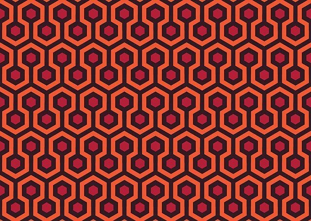
Shag Rugs: The Grooviest Floor Covering of the Mid-Century Modern Era
Picture this: it’s 1967. You’re sipping a martini in a low-slung Eames lounge chair, the hi-fi is spinning Sergio Mendes, and under your bare feet is a plush, two-inch-deep ocean of shag. That, friends, was peak mid-century modern living.
What Made MCM Shag So Iconic?
Shag rugs exploded in the late 1950s and ruled living rooms through the mid-1970s. Unlike the tight loops of Berber or the flat weave of kilims, true shag had long, twisted yarns—sometimes 1–3 inches tall—that created a deep, sink-your-toes-in pile. The look was pure texture, pure indulgence, and pure rebellion against the hard-edged minimalism of early Bauhaus-inspired MCM.
Key features:
Materials: rayon (cheap and shiny), acrylic (soft and durable), or luxury wool blends.
Colors: avocado green, harvest gold, burnt orange, chocolate brown, and—by 1972—electric peacock blue.
Shapes: kidney beans, amoebas, and massive free-form blobs that ignored every rule of rectangular rugs.
The Cultural Moment
Shag wasn’t just a rug; it was a lifestyle statement.
It appeared in every James Bond pad from You Only Live Twice onward.
Verner Panton posed on white shag in his Visiona 2 exhibition (1970).
The Playboy bachelor pad playbook basically required a white shag rug next to a sunken conversation pit.
Fun fact: the original 1968 2001: A Space Odyssey set had a blood-red shag rug in the Hilton Space Station lobby—cut from the final film but immortalized in production stills.
The Designers & Brands
Egetæpper (Denmark) produced modular shag tiles that let you create psychedelic floor landscapes.
Edward Fields offered custom tufted shag for the high-end crowd—think $40 per square foot when minimum wage was $1.60.
Sears sold the “Leisure Lounge” shag in 22 colors for $89 (entire 9×12 room size). It was the IKEA Billy bookcase of its day.
Why They Disappeared (and Came Back)
By the late ’70s, shag became a punchline—impossible to clean, a magnet for fondue spills and pet hair. Wall-to-wall carpeting took over, and shag was banished to dorm rooms and van interiors.
Then, around 2015, something happened. Millennials discovered grainy ’70s interior photos on Tumblr, Jonathan Adler re-issued a wool shag line, and suddenly every boutique hotel lobby had a rust-colored shag island under a sputnik chandelier.
Today’s Shag: Same Vibe, Better Tech
Modern versions use solution-dyed nylon or recycled PET that resists stains and fading. Some brands (Rugs USA, Revival, Boutique Rugs) offer MCM-inspired shag in authentic colors for $200–$400 in 8×10—about the inflation-adjusted price of that 1969 Sears special.
Styling Tip from 2025
Want the look without the maintenance nightmare? Go for a low-pile “sculpted” shag (½–1 inch) in mustard or olive. Pair it with a walnut credenza, a ceramic table lamp, and one (just one) oversized monstera. Instant 1968 mood, zero avocado-green regrets.
Shag rugs were never just floor covering. They were the mid-century answer to “how do we make modernism feel cozy?” Turns out the answer was simple: make the floor hug you back.

Why Passive Architecture Is Quietly Changing Everything
Imagine a building that stays comfortable year-round with almost no heating or cooling bills. No roaring furnaces, no humming AC units—just smart design and physics doing the heavy lifting. That’s passive architecture, and it’s not a niche trend anymore; it’s the most practical revolution in building since concrete.
The Core Idea: Work With Nature, Not Against It
Passive design follows five simple principles (the Passive House standard, or Passivhaus, from Germany):
Superinsulation – Walls, roofs, and floors wrapped in so much insulation that heat barely escapes.
Airtight envelope – No drafts. Every seam is taped, every joint sealed.
Thermal bridge-free construction – No cold spots where heat sneaks out.
High-performance windows – Triple-pane, argon-filled, strategically placed for solar gain in winter.
Ventilation with heat recovery – Fresh air flows in, stale air flows out, but 80–90% of the heat stays inside.
The result? A house that needs less than 15 kWh/m² per year for heating—about 90% less than a typical code-built home.
Real Numbers, Real Places
In Brussels, the first certified Passive House was built in 1991. It still uses ~10% of the energy of its neighbors.
In Dartmouth, Nova Scotia (zone 6, brutal winters), a Passive House duplex built in 2014 has never turned on its backup heater. Total heating cost last year: $180 CAD.
Even in hot climates: the Craftsmanship Museum in Carlsbad, California, stays cool using passive shading and night-flush ventilation—no AC required.
Beyond Energy: Comfort and Health
Passive buildings are eerily quiet (triple-pane windows block street noise) and the air is always fresh thanks to balanced ventilation with filtration. Mold? Almost impossible when humidity is controlled and walls stay warm. During wildfire season in the West, people literally shelter in Passive Houses because the airtight envelope plus MERV-13 filters keep smoke out.
The Myth of “Too Expensive”
Yes, upfront costs run 5–15% higher than code minimum. But:
Energy savings pay back the premium in 7–12 years.
Mechanical systems shrink dramatically—one Minnesota Passive House heats with a 1,500-watt hair-dryer-sized unit.
In Europe, where energy prices are triple North America’s, passive is now cheaper to build than conventional because banks offer lower-interest “green mortgages” for proven low running costs.
The 2030 Horizon
The EU has mandated nearly-zero-energy buildings for all new construction by 2030. California’s Title 24 is marching in the same direction. Architects who ignore passive principles today are basically designing next decade’s white elephants.
Final Thought
Passive architecture isn’t flashy. There are no solar panels to Instagram (though you can add them). It’s just walls, windows, and airtight tape doing what they should have been doing all along: making buildings that don’t fight the climate—they dance with it.
If you’re planning a build or renovation, start with the passive checklist. The future of architecture isn’t louder or more complicated. It’s quieter, calmer, and finally makes sense.

Mid-Century Modern Landscaping: Nature, Structure, and Simplicity
Mid-century modern design didn’t stop at the front door—it extended outdoors, embracing the idea that your landscape should be as thoughtfully designed as your living room. From breezy backyards to sculptural front entries, MCM landscaping brought structure, simplicity, and a love for native plants into harmony with bold architectural forms.

What Did the Mid-Century Modern Era Smell Like? Popular Scents of the 1950s–60s
When we think of mid-century modern design, we picture clean lines, sleek furniture, and space-age style. But what about the scents that filled those homes and defined the atmosphere of the era?

The Most Expensive Mid-Century Modern Designers
Mid-century modern design, flourishing from the 1940s through the 1960s, introduced a fusion of functionality, simplicity, and organic forms that revolutionized furniture and interior aesthetics. Today, the works of certain designers from this era are highly coveted, with original pieces fetching impressive sums at auctions and in private sales.

Halloween Costumes from the Mid-Century: Classic Looks with a Retro Twist
When you think of Halloween costumes from the mid-20th century—roughly the 1940s through the 1960s—you’re stepping into a world of playful imagination, homemade creativity, and classic characters that still inspire costumes today.

How Mid-Century Fashion Designers Shaped Interior Design
The mid-20th century was a golden age for creativity, where boundaries between disciplines like fashion and interior design blurred, inspiring a seamless flow of ideas. Fashion designers of the era didn’t just influence what people wore—they helped shape the very spaces people lived in.

The Best Houseplants to Liven Up Your Home (Without Driving You Crazy)
Bringing plants indoors does more than make your space prettier—it boosts mood, improves air quality, and adds that touch of life that no throw pillow ever could. But not all plants thrive in indoor environments. Some need constant attention, while others practically thrive on neglect.
Here’s a curated list of the best houseplants for interior spaces, perfect for beginners and design lovers alike.

The Bold Brilliance of Curtis Jere: Sculptural Style that Defined an Era
If you've ever seen a dazzling brass sunburst, a windswept tree in hammered metal, or an abstract wall sculpture with brutalist flair—there’s a good chance it was signed “C. Jere.” But Curtis Jere isn’t a single artist. It’s the signature brand of Curtis Freiler and Jerry Fels, the duo behind the design company Artisan House, founded in 1963.
Together, Freiler and Fels set out to bridge the gap between fine art and home décor, producing bold, sculptural pieces that could live above the fireplace or in a corporate lobby. Their work brought a sense of avant-garde sophistication to mid-century interiors—and continues to influence modern design today.

How NC State Shaped Mid-Century Modernism in North Carolina
If you've ever admired the clean lines, open plans, and natural integration of a mid-century modern home in North Carolina, there's a good chance its design DNA can be traced back to NC State University’s School of Design.
A Radical New Approach: The Birth of the School of Design
In 1948, NC State hired architect Henry Kamphoefner to launch its School of Design (now the College of Design). Kamphoefner, influenced by European modernism and Frank Lloyd Wright’s organic principles, attracted a faculty of forward-thinking architects who brought modernist ideals into the heart of the American South.

Where to Find Mid-Century Homes & Tours in the Triangle
While there aren’t always tours exclusively for mid‑century homes, there are several relevant events, groups, and resources:
NCModernist — A nonprofit archive and community focused on modernist and mid‑century houses in North Carolina. ncmodernist.org
AIA Triangle Tour of Residential Architecture — Annual fall tours of architect‑designed homes across the 10‑county Triangle region. Some homes are historic or renovated mid‑century homes. aiatriangle.org+2aiatriangle.org+2
Preservation groups / Modernist enthusiasts often organize special house tours or “Modernist Home Tours.” NCModernist is a good place to watch for those. ncmodernist.org+1
Neighborhood walks & walking tours — Some neighborhoods include mid‑century architecture among their houses; while not always labeled “mid‑century,” historic architecture tours or architecture walking tours might include examples.
Real estate listings with style filters or descriptive keywords (“mid‑century modern”, “modernist”, “mid‑century ranch”, etc.) can help you spot potential homes to visit or drive by on your own.